top of page
Papaya
A mobile dedicated site where young women can get personalized birth control recommendations.
My role: Art Direction, UI & UX
Concept developed at General Assembly


The Challenge
Young women of color need a more accessible and discrete way to find personalized birth control recommendations because they feel uncomfortable discussing their sexual health with doctors.
Research & Interviews
I spoke to several young WOC and asked them a series of questions about their sexual and reproductive health - specifically how they searched for information regarding birth control methods. I gathered the insights I recorded during the interviews and created this Affinity Map. From there, I gathered these 3 main user insights.
Fear
Many young WOC avoid gynecological check ups because they feel intimidated by the current healthcare system.
Confusion
They’re not sure how to find
a birth control method that
is right for them due to a large amount of online articles with conflicting information.
Disconnect
They are frustrated by the ‘girly’ imagery often used to market anything related to female reproductive health.


The solution
With these research insights, my solution was to create an inclusive and gender neutral site where young women of color can get personalized birth control recommendations. Its design should feel intuitive to the target user, so they can get essential sexual health information in a format they are comfortable with and more likely to use.
User Flow

Wireframes
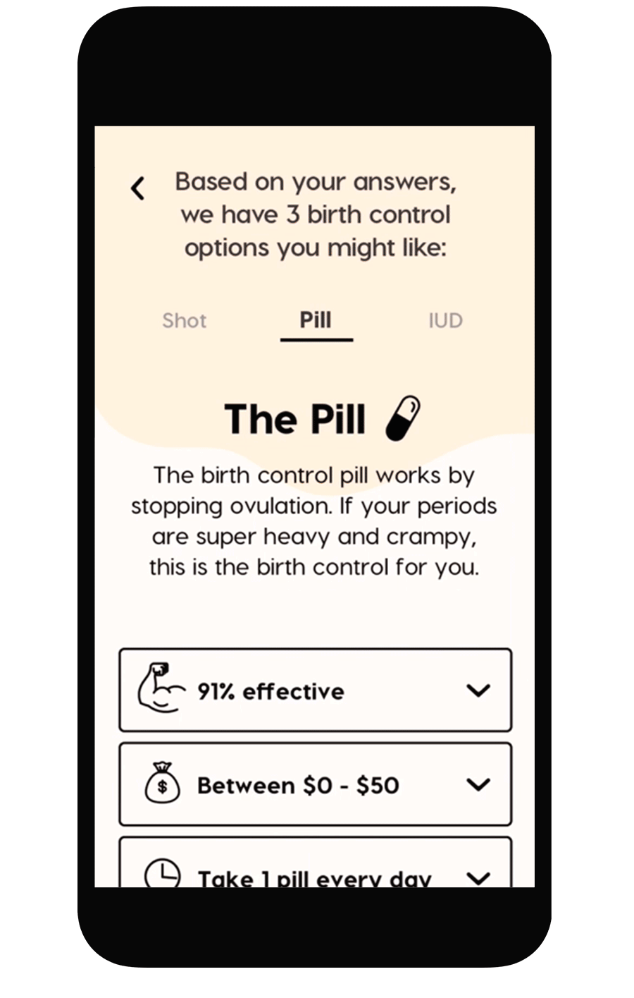
During the interview process, it was clear that many young women find the birth control research process daunting. Because of this, I developed a quiz experience that asked just the right amount of questions with a relatable tone of voice. After the results, the user has the option to chat with a medical professional for further questions. For continued support and engagement, the user can sign up for Papaya's newsletter.

Art Direction
Often times, websites in the medical industry feel too corporate and clinical. I wanted the visual design for this project be a departure from the typical wellness websites, as well as hyper feminine marketing.
Moodboard

I created a visual identity inspired by warm colors and organic shapes, accented by a clean typeface and playful icons.


Final Designs

bottom of page